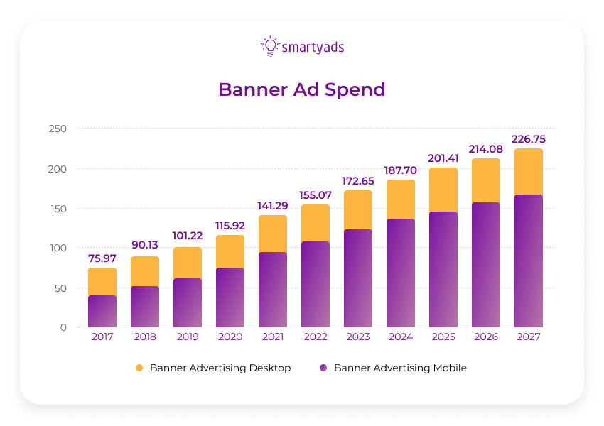
Limited budgets often stipulate advertisers rethink display advertising efficiency so they pay more attention to standard banner ads. In 2021 online banner ads reached $141,29 billion, and today more than 60% of banner ads within the Google display network are shown on mobile devices.
Banner advertising matters and every advertiser should realize the importance of banner sizes, design, and ad placement. Now banner ads are essential parts of display advertising; so how to fine-tune them properly?
What is a banner ad?
A banner ad is a static image that we often encounter online; it is worth noting that these ad formats normally appear on desktop and mobile. These display ad units are at times even more popular than business promotions, because they are truly universal. Website banner standard size can be small, medium, or large.
Some banner advertising units come to their maximum size when they reach the viewable area (expandable banners); the others can include additional media elements in them (e.g in-banner video triggered by users).
Plus, there are a lot of interesting banner ad formats, however, today we are going to talk about banner ad sizes to determine how they impact the outcomes of the ad campaigns.
A banner ad can appear on the web page or in the app. Banner ad sizes can be different and that's why IAB issued specific guidelines and ad specifications that advertisers can take into account while crafting ad units.
Benefits of banner ads
Banner ads work perfectly on mobile devices, desktops, and CTV because they have the:
- wide coverage of the target audiences;
- highly targeted user experience;
- real-time performance statistics and tracing of campaigns.
Why choosing the right banner size is very important
Ad quality is very important, that's why advertising networks, DSPs, and ad exchanges now implement a stringent approach to ensuring ad quality according to the IAB.
Improving loading time
Incorrectly chosen banner advertising format and ad size can have an impact on site loading speed, which will affect the overall user experience. Additionally, if the resolution of image ads is too small for the ad slots then the ad messages will be blurred or displayed in poor quality which will also damage the brand's reputation and user experience.
Avoiding accidental clicks
The wrong ad size can cause accidental clicks — ad messages should occupy just the right amount of user screen. Wisely chosen banner ad sizes will not irritate the users and this will translate into better brand loyalty.
Most common banner ad sizes for display campaigns
Let us take a look at the desktop and mobile ads. Popular banner ad sizes differ in performance. Bigger ad sizes improve performance because they catch the user's eye.
Different banner ad sizes have different performances, so the list of the most effective banner ad sizes is as follows: 320x50, 728x90, 320x420, 300x250, 480x320, 768x1024, and 1024x768.
Some believe that the Leaderboard 728 banner is more effective than the Medium Rectangle (300x250) banner. However, others think that the most popular is the Medium Rectangle (300x250). What's particular about Leaderboard 728 and medium rectangle banner ads? And in what cases those can be the most appropriate and winning formats?
Leaderboard 728
Leaderboard 728x90 is an image ad that is 728 pixels wide and 90 pixels tall. This web banner is getting noticed on the page even better than animated banners. Among the wide variety of other options, it stands out because it is horizontal so it is placed on the top of the web page.
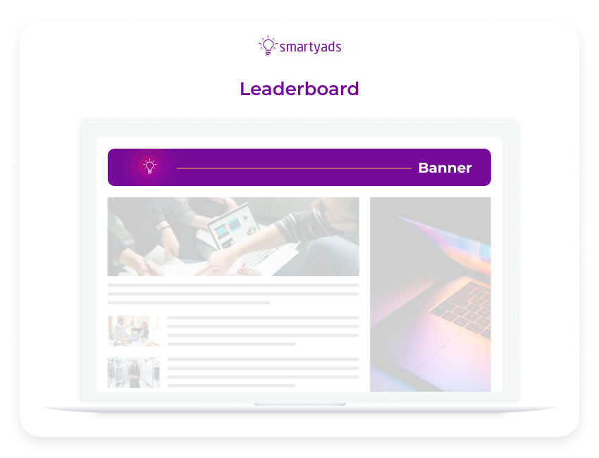
Leaderboard 728 is used above the fold and for this reason this banner ad size is incredibly popular among advertisers. The large leaderboard format is very popular on the desktop, however, in the mobile web environment, it obviously occupies less space.
If you want more tips regarding this format, just in case you use this ad below the fold, it is important to make sure that the “lazy loading” is enabled, meaning that the ad unit should only load when it is on the screen or at least some part of it reaches the screen.
If lazy loading is not implemented, then such a standard banner can slow down the speed which may negatively affect the user experience. The outcome is — this format can drive really spectacular RPM, however, they may slow the loading speed so it is important enabling lazy loading.
It is worth mentioning that a vertical banner sometimes captures user attention better, contrary to a horizontal banner (e.g. wide skyscraper banners).
In general, the most popular standard banner ad sizes are the following:
- the Medium rectangle;
- the Large rectangle;
- the Mobile Leaderboard.
Let's review those starting from the mobile leaderboard banner.
Mobile leaderboard ad
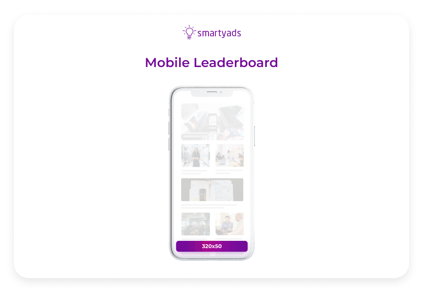
Let's review the mobile leaderboard format and the cases when it can be the most suitable for your campaigns. The mobile leaderboard is known to be the most popular format on the Google display network.
Being 320 pixels wide and 50 pixels tall, this ad unit easily fits many mobile screens. So, this size leaderboard is more fitting for many screens.
This format falls within standard banner ad sizes because it is increasingly popular for branding campaigns. It is certainly not a large mobile banner, however, exactly the small ad size is the reason why most publishers choose it — it is seen as less annoying for visitors.
It can be your top choice in case you use Google ads. The bigger ad format would normally cost more than this banner and the quality makes it the most affordable format.
However, if you plan to launch Google ads with a mobile leaderboard, keep in mind that your ad message should be very short and concise since the ad space on the creative is limited.
Large mobile leaderboard
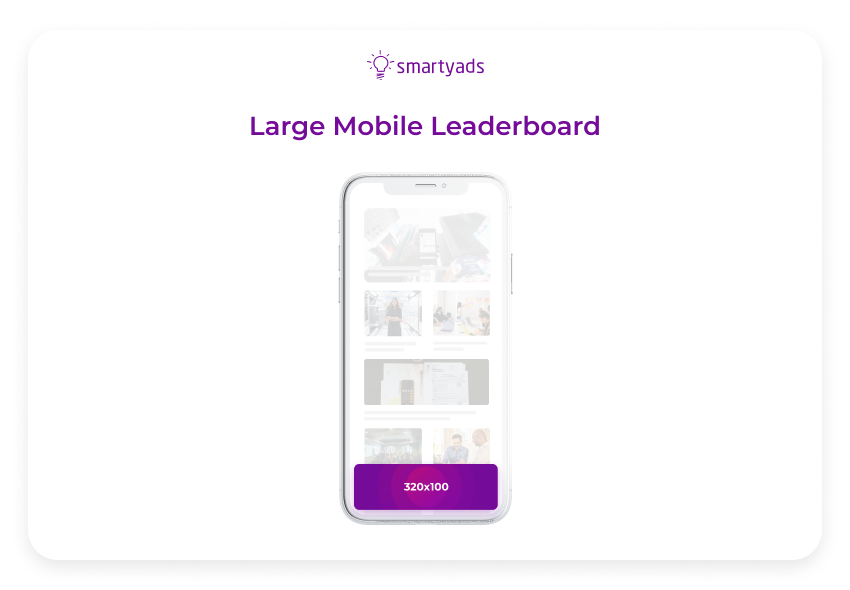
Another variation of the previous format is a large leaderboard banner. The large-size leaderboard is mobile-friendly and has dimensions of 320 pixels in width and around 100 pixels in height.
Although the name says that this display advertising banner is big, indeed it is small and suitable for many types of ad inventory.
Since large mobile leaderboards are quite noticeable, they can bring in greater viewability and impeccable ad performance across various mobile devices.
Those can be placed in the nice article or at the end of it. The next standard banner type that we are going to review is called a large rectangle.
Large rectangle
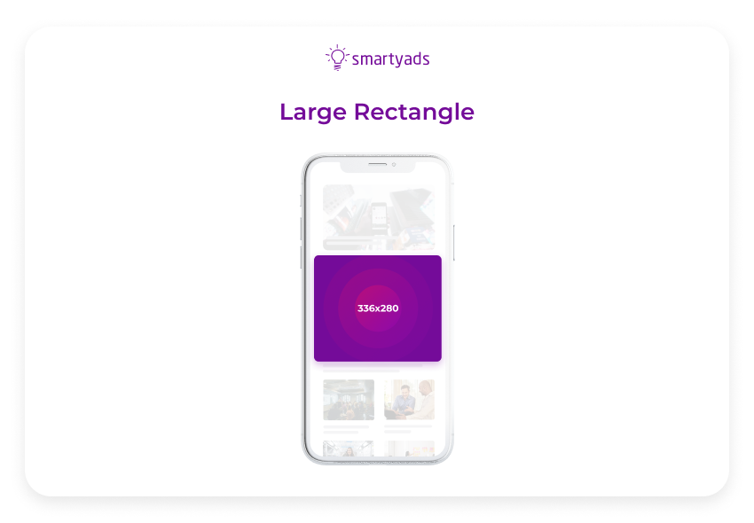
A large rectangle is an ad format whose name speaks for itself. Although it implies that this banner ad is big, indeed large rectangle is just 336 pixels wide and 280 pixels tall.
It is called large because it is slightly bigger than a medium rectangle ad. By the way, Interactive Advertising Bureau delisted this format from the most popular ones although it is a still top choice for Google ads because it has high performance and eCPM.
A large rectangle banner ad is normally placed on the right side of the content or text articles. They are very easy to design as ad units are pretty simple.
You can use this format as a page break or an ending to an organic piece of information.
Such banner types are very rarely used outside of AdSense, so it's worth a shot in case you use this ad platform.
However, if you also use a bunch of other ad platforms for popular banner ad sizes, it may become an issue so it is highly advised to adapt your unit ad size or use a medium rectangle ad instead.
Medium rectangle
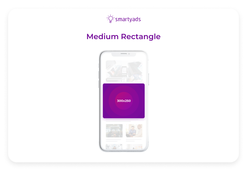
A medium rectangle is also a top-performing banner ad. Such display ads are perfectly suited for both mobile web and in-app environments. These image ads (medium rectangle 300x250 px) are great for many types of display advertising campaigns.
Display ads, like 300x250 medium rectangles, are very common banner ad sizes so in most cases, they will cover as many publisher placements as possible.
This means that in the end, the advertiser will be able to serve maximum ad impressions and the reach will be impeccable.
For the best user experience, a medium rectangle should be placed in the nice article in between paragraphs or at the end. A 300x250 medium rectangle will also have no impact on the loading speed which is a big bonus.
Half-page ad or double rectangle
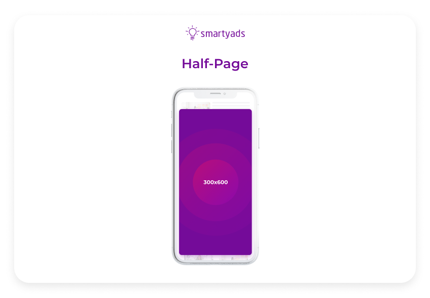
Half-page ad is commonly referred to as a double rectangle, it has a resolution of 300x600px.
Half-page is obviously taller than most common banner sizes for mobile, including medium rectangles. However, it is not the maximum ad unit size as some parts of the screens can still be seen.
Half-page normally covers quite a lot of space on the screen so naturally, it becomes very memorable. It is a good choice to draw attention to the important ad message or hot offer.
This mobile banner can be a top choice for location-based campaigns since it can effectively capture user attention. If you try to avoid excessively intrusive user experience then give preference to medium rectangle placed amidst great article.
Wide skyscraper ad
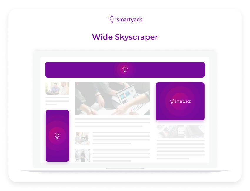
A wide skyscraper (160x600) ad occupies a lot of space on the user screen and is normally used to fill the ad space on websites. It is often referred to as a “standing banner” as it has a resolution of 160 pixels wide by 600 pixels high.
Unlike other banner types of smaller banner ad sizes, this one is hard to miss on the page. Normally, a banner ad like this is placed on the left side of the web page or in the upper corner of the page.
When is the best time to use a wide skyscraper banner ad? Advertisers choose this banner ad because it is affordable although it occupies a bigger ad space.
It can be a good choice for memorable branding campaigns and performance campaigns as well. A wide skyscraper is also a top choice for desktop campaigns. It is a nice idea to combine wide skyscrapers with interesting or useful web content. To avoid accidental clicks don't place this banner too close to the navigation menu.
What to choose — standard or non-standard banner sizes?
The standard banner for mobile applications is the medium rectangle banner (the banner size of 320x250), often embedded in content and/or located at the top of the page. Another top-performing banner ad is the mobile leaderboard (320x50).
Unfortunately, it is available only on mobile. What about other not-so-commonly used standard banner sizes or custom-sized banner ads (for instance, wide skyscrapers or skyscrapers)? Is the non-standard ad size a guaranteed failure only because users are more accustomed to standard banner sizes? Let's try to understand.
From a marketer's perspective
What are the best-performing banner ad sizes? Some prefer the standard banner size and agree that the medium rectangle is the gold standard for those who plan to serve ad campaigns on global inventory.
However, the top-performing banner ad sizes also include large rectangles and leaderboard standard banners. The designers and entrepreneurs prefer the large rectangle, and the marketers prefer the leaderboard ad units.
From the user's perspective
Other ratings consider banner ads through the prism of users' impressions, campaign performance, and/or platforms. Anyway, the medium rectangle banners take precedence.
Other standard banner sizes such as half-page and mobile leaderboard ads are less popular although they can be the best-performing banner ad sizes in many cases.
Adaptable banner ads
Additionally, on modern ad platforms, advertisers can choose the specific banner size (the custom one) and adapt it automatically to the resolutions of the ad inventory it is served on. Such a feature is implemented on SmartyAds DSP and is called creative autoresize.
So, how to use this leverage in order to adapt your ad size each time the ad impression takes place at the publisher's ad inventory? First, let's see how to adjust ad sizes manually.
How to adjust banner ad sizes?
When you make your own banner from scratch and adjust it to better suit every screen type it takes a lot of time and effort. However, this task is important and should not be ignored since this way you ensure that your ad message is rendered correctly.
Otherwise, your original banner may appear too small, so the ad slot will stretch the image to make it fit and as a result, the quality of the ad impressions will be compromised.
What is a solution to this problem? For starters, it is important to make sure that your ad images meet the specs of the site (inventory) if you place ads manually.
In case you run campaigns on ad platforms, you'll be serving ads on global ad inventory, so be sure to check the info about the size before you upload the creative (as a rule, this information is displayed in the dashboard when you create a campaign).
How to keep the banner size perfect automatically?
If you want to automatically turn your creatives into standard banner sizes that fill as many ad spaces as possible then you might need to apply the creative autoresize function.
Creative autoresize is a proprietary function of SmartyAds DSP that resizes the creative size according to the parameters of the ad slot it is served in.
Creative authorize
At the end of ad campaign creation on SmartyAds DSP, you need to upload creative. In the window where you add the creative, you'll find the toggle ‘Autoresize'.
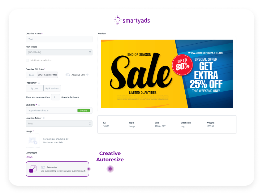
Then the autoresize toggle should be activated. After this, all the creatives will be automatically fitted to ad placement. This feature is especially valuable for those advertisers who have non-standard banners. The optimized size will keep the resolution perfect so that advertisers will get more ad impressions by filling more ad placements.
Some important aspects of banner placement
Let us look through the prism of banner placement, but not only through the banner ad sizes. The half-page, wide skyscraper, and large rectangle banners are effective too — not only the medium rectangle.
People rarely scroll to read a great article. That's why other banner ads may not attract as much traffic as the medium rectangle.
The banner sizes or their positions are key important things. Banner ads are the first things that catch your eye and that's why they are often placed at the top of the page.
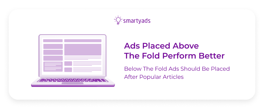
It all depends on the content
However, if the article on the web page is really interesting, the chance that the user will notice the ad at the bottom of the page will significantly increase.
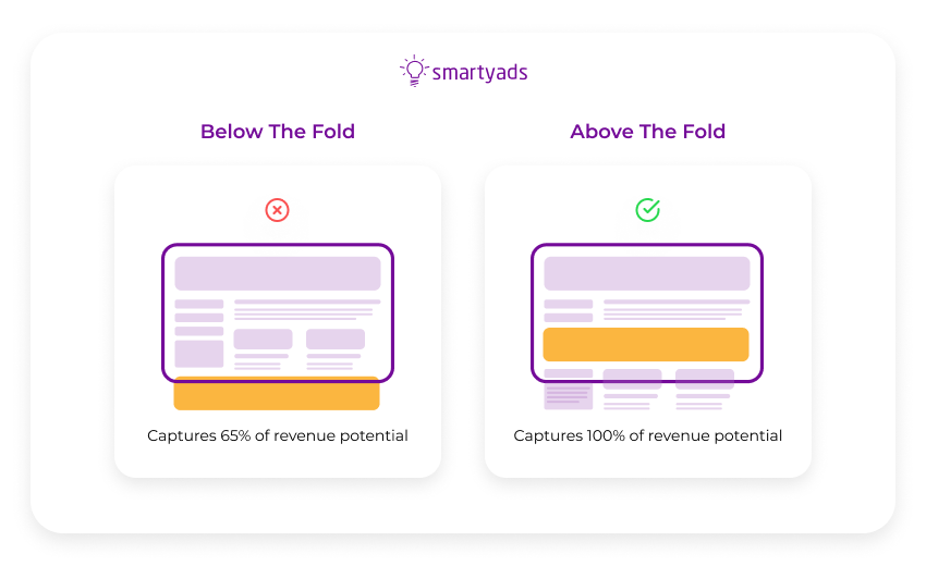
At the bottom of the page banner ad can appear in the form of recommendation widgets (like “read more” blocks).
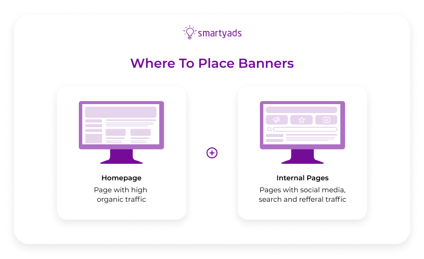
We recommend you take into account not only the ad size but also its aptitude. It is a mistake to ignore small banner sizes (for example, a small square banner). Many people will see them since they can fit a large number of placements.
Top performing banner ad: where to place it?
The conversions are not determined by the banner size only. Since the ad sizes of the banners mentioned above are different, the content should have the maximum impact, because people decide to click or not in less than 1 second.
The banner ad should be balanced, correspond to the style of the company, be readable, use the displayed fonts, and not be overloaded with information and/or animation.
The right channel
What really matters is not banner ad size, but the answer to the question — what size of the banner is suitable for the channel you are going to advertise in; mobile, in-app, desktop, and CTV are very different environments.
In general, it is known that for cheap large volumes of traffic you can freely use sizes like 300x250 and 300x100, but for expensive large volumes (the target audience is numerous and solvent) preliminary testing is essential.
What about banner design?
It is commonly believed that banners should be of vibrant colors, however, it is only universally true for outdoor billboards and screens like DOOH. Stunning visuals are also common for a vinyl banner ad. It applies to outdoor vinyl banners installed at trade shows and big gatherings.
Vinyl banner for indoor and outdoor usually has the main purpose to capture attention. In contrast, digital banners can also lead the viewer to the right web page for making a purchase.
Vinyl is different from digital banner ads
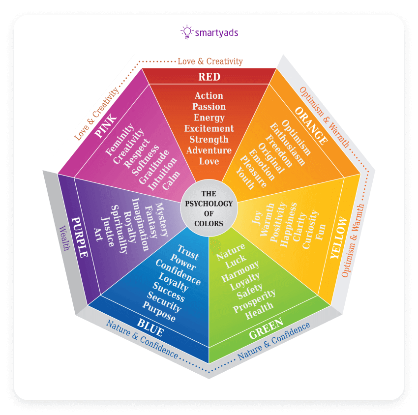
Thus, the design of the vinyl banner and the digital one will often be different. Vinyl banners or print banners have to depend on the print quality and large format printers. Best display ad examples of digital banners meanwhile illustrate that the key priority should be given to the right messaging and selection of the right color scheme.
DSP by SmartyAds
What is a demand-side platform (DSP)? DSP by SmartyAds provides really unlimited access to programmatic media buying, advanced targeting (including targeting settings for ultimate precision: frequency capping, dayparting, dynamic retargeting, IP targeting), many types of programmatic advertising deals, and real-time campaign tracking.
So, it is not a surprise that SmartyAds has won the High Performance on G2 for 2020, 2021, and 2022 (according to the user's feedback).
The good news is that you can get the best results on SmartyAds DSP while you place ads on desktop and mobile web, and of course in apps. Here you can also find support for the vast majority of channels, verticals, banner advertising formats, and video ads suitable for specific guidelines.
We accumulate the best global inventory and finest online advertising traffic so that your banners could easily attract attention and convert into outstanding memorability and lots of user clicks.
On SmartyAds DSP you can serve the most effective banner advertisements (standard banner ad size or customer banner ad resolution). There are all banner sizes for all environments. The platform is ideal for custom and standard banner ads and presents the best mobile ad sizes.
